Building an App Store Connect API Dashboard
Apsity is the dashboard I built to combine 12 apps' revenue, keywords, and competitors into one screen. Two months in, my 25-minute morning routine dropped to under 5.
On this page (10)
May 2026 · Lazy Developer EP.02
I have 12 apps on the App Store. It started with one. One became two, two became five, and at some point twelve. The problem is that every one of those apps adds something to check every morning. Open App Store Connect, pick an app, look at yesterday's downloads, look at revenue, look at keyword positions, compare the competitor page. Twenty-five minutes were going there every morning.
I built a dashboard because those twenty-five minutes were annoying me. I named it Apsity. I have been running it for two months. Now the data comes in while I sleep, and when I open one screen in the morning I can see how all 12 apps did yesterday at once. This post walks through what is actually on that screen.
- Yesterday's downloads, revenue, and subscribers across all 12 apps in one screen
- Revenue auto-converted to USD so trends are not warped by FX
- 30-day stacked chart by revenue type
- Tracked keywords with yesterday's rank, week-over-week delta, and difficulty
- Daily auto-comparison for whether competitors changed name, subtitle, or price
- Data flows in overnight — I just look at it in the morning
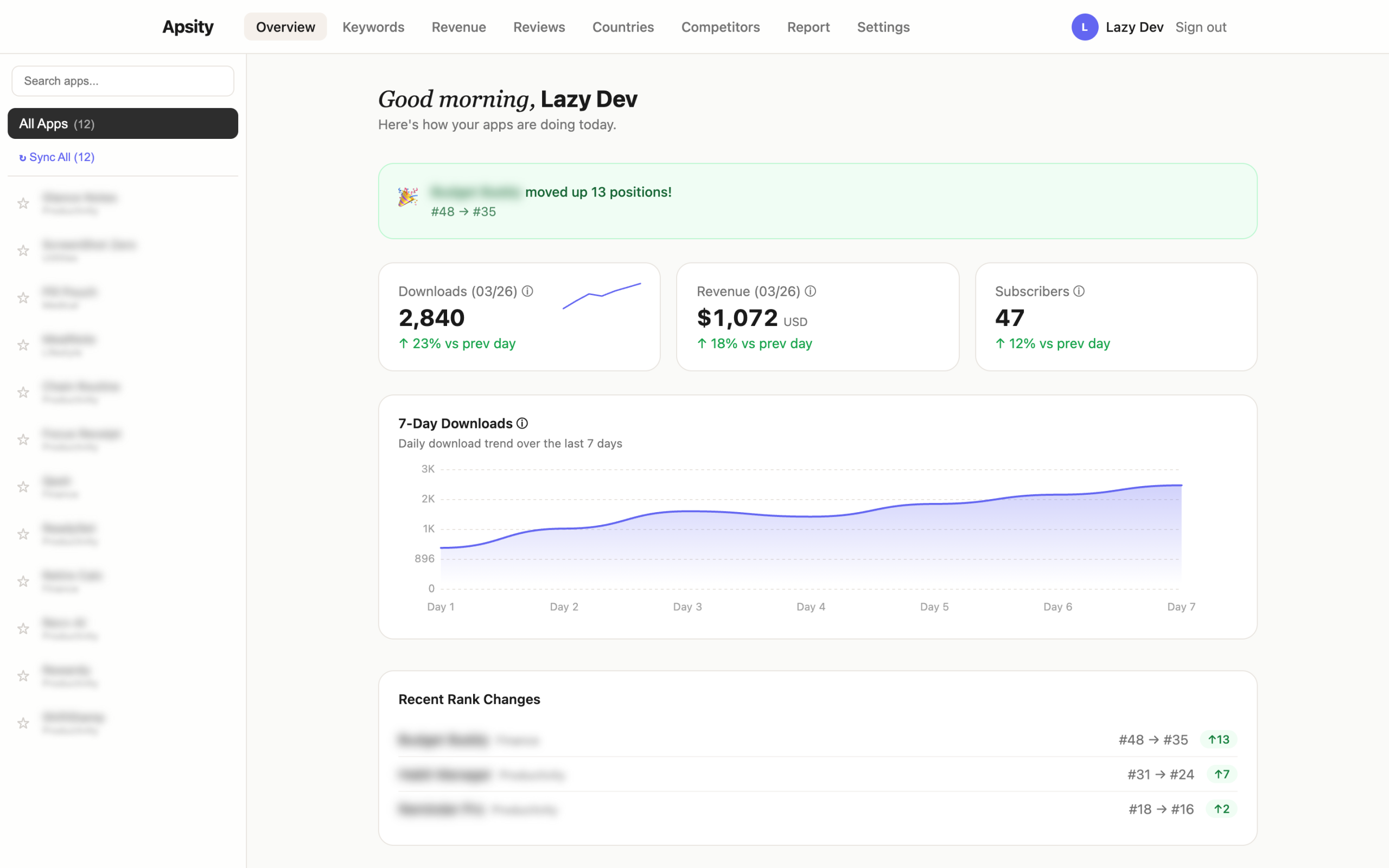
All 12 apps in one screen
When the dashboard opens, four metric cards are right at the top. Today's total downloads, yesterday's total revenue, current active subscribers, and the best keyword rank. Each card has a tiny graph next to it showing the last seven days. If downloads suddenly spiked yesterday, the line jumps.
Scroll down and per-app rows appear one by one. App name, yesterday's downloads, yesterday's revenue. Sorted by revenue, descending. At a glance you can tell "which app is doing well and which one is sliding." Even with 12 apps, everything fits in one screen.
App Store Connect is one app at a time. With 12 apps that means clicking into 12 pages, and any total you want, you compute in your head. Apsity does not do that. It rolls incoming data into one row automatically.
The currencies combine themselves
Apps sold in many countries return revenue in many currencies. Korean sales come in KRW, Japanese in JPY, US in USD. To combine them you multiply by an exchange rate, and exchange rates move every day. Today's revenue can look lower than yesterday's just because the won moved. Real revenue did not drop — the rate did.
Apple already provides a converted value (proceeds). Apsity uses only that. Trends stay on a consistent baseline without FX warping the picture. If revenue fell, it really fell. It was not the won.
Revenue tab — see by color where money comes from
In the Revenue tab, 30 days of revenue stack up as colored bars. App sales (paid downloads), in-app purchases, and subscriptions are three different colors. Inside each bar you can see how the three types mix. Is the subscription portion growing? Are IAPs shrinking? One glance answers it.
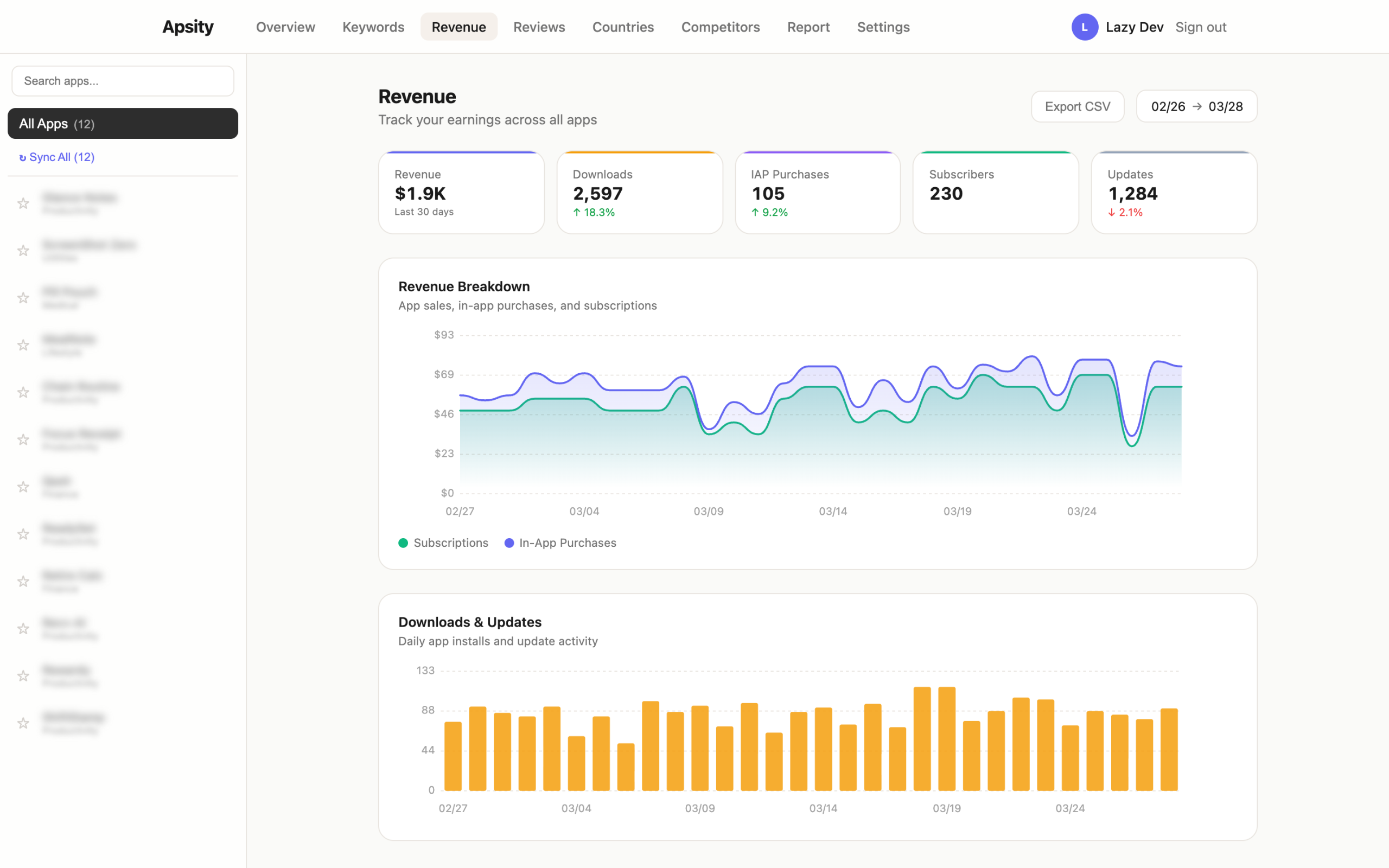
Subscribers live on a separate screen. Total active subscribers, yesterday's new signups, yesterday's cancellations — all in one row. Renewal rate is right there too. New users matter, but if renewal rate slips, they eventually drain out. Renewal rate is the slowest indicator to break, so I look at it every day.
Keywords — see where my app sits every day
The Keywords tab is a table of registered keywords. Keyword, yesterday's rank, week-over-week change, search difficulty. Dropped rankings are red, climbed rankings are green. If a keyword that was #5 yesterday is suddenly #50 today, the red catches my eye the second I open the screen.
There is also a difficulty score next to each keyword. It expresses how locked-in the top 10 apps for that keyword are, on a 0–100 scale. If the top of the list is packed with apps that have many ratings and high ratings, difficulty is high. Low-difficulty keywords are the gaps an indie app can squeeze into.
The same screen has a scatter chart. The horizontal axis is difficulty, the vertical axis is rank. The upper-left quadrant is the golden zone — low difficulty, high rank. A dot in that quadrant is a signal to push the keyword harder into the metadata.
Competitors — auto-compared every day
Each of my apps can have up to five competitors registered. Apps in the same category with a similar position. Once registered, Apsity grabs their pages every morning. Name, subtitle, description, price, screenshot count — everything. Yesterday's pull is diffed against today's.
A competitor changed their subtitle. Dropped their price. Added a new screenshot. Each change becomes a row in the Competitors timeline. The before/after is shown for what changed. A single subtitle line can move revenue, so tracking what competitors try is worth it.
Realistically, no one checks five competitor pages by hand every day. Once or twice maybe. After a month, never. But if changes show up automatically in a timeline, you actually look.
All of this runs while I sleep
The whole pipeline runs overnight. Around 3am Korea time yesterday's revenue and downloads land. At 3:30am keyword rankings refresh. At 4am competitor snapshots update. I just wake up and open the dashboard.
No buttons to press. No "Sync Now." Same job at the same time every day, so it just runs itself. In two months, I have hit the manual sync button maybe twice.
Sometimes Apple's side does not return yesterday's data on time. Apsity retries six hours later. If yesterday's slot is empty in the morning, it fills in around lunch. From the user side, the data is just there at some point during the morning.
Two months in — the screens I actually use
When I built it, every screen felt critical. Two months later, the ones I actually open settled out. The main dashboard (downloads / revenue cards) and the Keywords tab. Every day, once. The full Revenue chart and the Competitors timeline, two or three times a week. The Countries tab maybe once or twice a month.
The 25-minute morning routine fell to under 5. That is the whole result of two months of running this. The "open 12 ASC pages, back out, repeat" loop is gone.
Why build it myself
Similar tools exist. Sensor Tower, AppFollow, App Annie. They are all fine. The problem is that registering 12 indie apps with any of them lands me on a monthly bill that does not match the apps' revenue. And 80% of the features are not for me. Global market trends, category comparison tables, ad intelligence — those are for enterprise analysts. I just needed "yesterday's revenue and keyword positions across my 12 apps."
It was faster to build a tool that contains exactly that and nothing else. Toss the requirements at Claude, code comes back, push it to Vercel, it runs. Two months of running costs fit inside Supabase's free tier and Vercel's free tier.
And because it is my own app, I can keep adding things. Once the dashboard was running, a new kind of annoyance appeared. "I can see the numbers, but what should I do about them?" EP.03 is about the AI layer I bolted on top.
FAQ
Q. What is Apsity?
Apsity is a dashboard for iOS app operators to see the revenue, downloads, keyword rankings, and competitor changes for all of their apps in one screen. I built it because clicking through App Store Connect every morning got old.
Q. Can it sum revenue across multiple apps?
Yes. Even with 12 apps, the main screen shows yesterday's total revenue, total downloads, and active subscribers in a single row. Revenue comes in already converted to USD, so trends are not distorted by exchange-rate swings.
Q. How does keyword rank tracking work?
You register the keywords you want to track and the dashboard pulls their rankings every morning. The table shows yesterday's rank, the week-over-week change, and the search difficulty. Keywords that dropped sharply are highlighted in red.
Q. How does competitor tracking work?
You register up to five competitor apps per one of your apps. Each day the dashboard checks whether their name, subtitle, description, or price changed. If a competitor swapped their subtitle or dropped their price, a row is appended to the Competitors timeline.
Wrapping up
After two months I almost never open ASC anymore. The main dashboard and the Keywords tab are enough. On weeks where something moves, I dig into the Revenue tab or the Competitors timeline. A 25-minute morning routine became under 5.
After a few days of using the dashboard, a different kind of annoyance set in. The numbers are there, but "what should I actually do about them" is not. Downloads dropped — fine, but I still have to figure out why. EP.03 is about automating that judgment step with an AI growth agent.
This post was written in May 2026. Apsity is currently syncing 12 apps daily.
Related Posts
Automating App Growth Analysis with Claude API
A two-month review of the AI Growth Agent built on top of Apsity. AI keyword recommendations, keyword health, confidence badges, growth stages, and the weekly email — walked through screen by screen.
Automating CLAUDE.md for Claude Code Session Context
I got tired of re-explaining project context every time I opened a new Claude session. So I automated CLAUDE.md updates, cowork schedules, and timeline logging — four manual tasks turned into one workflow. Here is how.
Claude Code Workflow for Solo Developers
How I keep Claude Code beside me all day as a solo developer — morning context recovery, CLAUDE.md, four rules, custom MCP, and auto-logging, walked through as one daily loop.